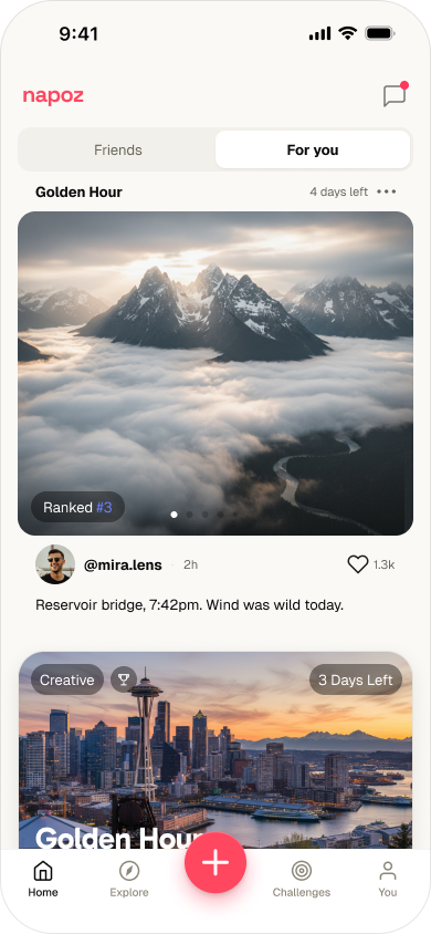
Golden Hour4 days left
Ranked #3
@mira.lens2h♡ 1.3k
Reservoir bridge, 7:42pm. Wind was wild today.
Colors without hierarchy. Six button styles. Two words for the same state. I rebuilt Napoz around a single idea — what a challenge actually is — and gave it one language across every screen.
The app could do everything and explain none of it.
Napoz let anyone start a challenge — a 30-day writing streak, a neighborhood step competition, a sourdough showdown — all living in one community.
The product had evolved feature by feature, challenge by challenge.
It worked.
But it could do everything and explain none of it.
Every screen had improvised its own dialect — different colors, different buttons, different words for the same thing. New users couldn't tell a post from a challenge. The product lacked a shared language.
The evidence was sitting in the support queue:
"I don't know what I'm looking at."
This wasn't a visual-polish problem. It was a comprehension problem.
So I didn't start with screens.
I started with the smallest unit: design tokens, then components, then patterns, then the words themselves.
The obvious fix was to reskin the loudest screens and ship. I refused it. A reskin would have painted over the inconsistency, not removed it. Six button styles would still be six button styles under one coat of color.
Instead, I established one visual language, one component system, and one vocabulary for the product.
The redesign people see is the surface.
The system underneath is the actual work.
Now a first-time user opens Napoz and immediately understands what they're looking at.
Before any screen changed, I rebuilt the foundation from tokens up. Two years of improvising had scattered the basics — cool blues with no clear brand, system fonts, a pale button doing every job. The fix wasn't fewer styles; it was color that carries meaning, type with roles, and one inventory.
Three cool blues and a gold. Which one is the brand? No color owned a job.
Coral = brand & category. Cobalt = figures you earn. Each color, one job.
Generic faces, flat hierarchy.
Gabarito + Geist — a named ramp with set weights and tracking.
One pale light-blue button doing every job.
A real hierarchy — primary, secondary, ghost, text, and the create FAB.
8 starter groups — foundations only.
50+ elements across 8 domains — rank, streak, leaderboard, and the cobalt AI badge.
Four card modules. The Challenge Card renders one challenge in three formats; the other three each own one job — so two cards never compete for the same moment, yet shared radii, type, and color-roles keep them one family.
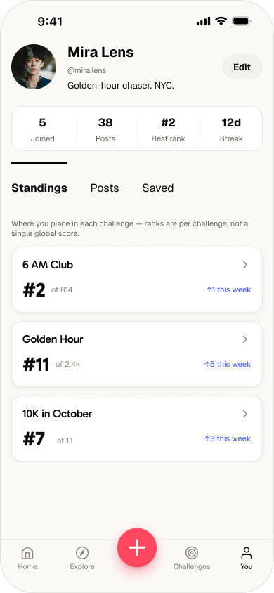
"Should I join this?" → "How am I doing?"
"every shadow deserves a witness."
1.1k in · 5d left
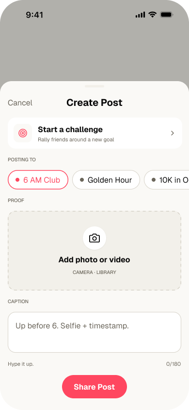
"What's happening?"
Reservoir bridge, 7:42pm. Wind was wild today.
Reservoir bridge, 7:42pm. Wind was wild today.
"What could I start?"
Pick a spot you walk past every day. Photograph it at the same hour. The week tells a story you didn't plan.
"Where do I rank?"
The same challenge object, rendered across the surfaces people actually use — discover it, track it, and live with it in the feed. Before on the left, after on the right.
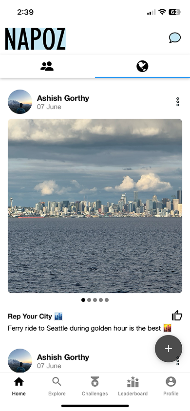
The old home stacked friends' posts and live challenges into one ambiguous list under a heavy wordmark. The redesign splits Friends from For You and gives challenges their own card — countdown, rank, category — so a commitment never reads like a casual post.
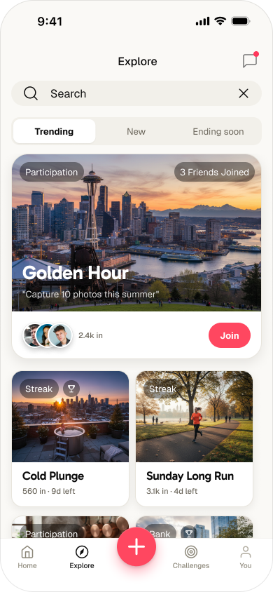
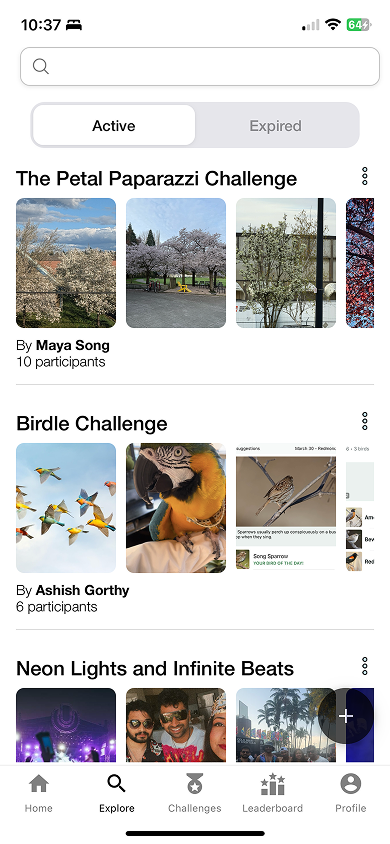
Explore was a dense list filtered by Active and Expired. The redesign leads with a featured challenge and social proof, sorts by Trending / New / Ending soon, and puts Join one tap away.
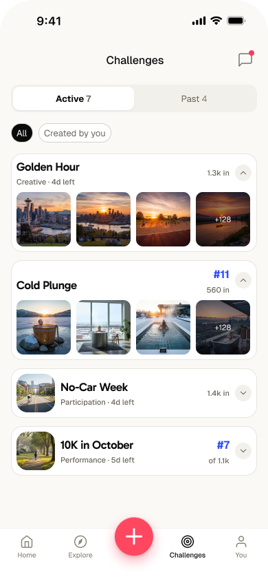
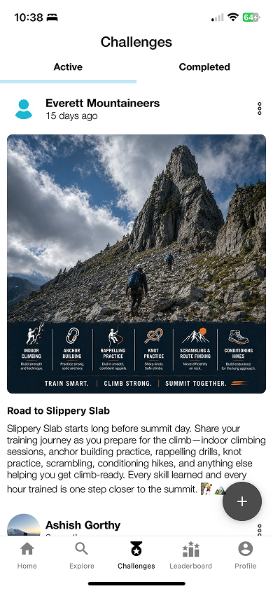
The Challenges tab buried one giant card per challenge. Now each is a compact row carrying the same metadata everywhere — category, time left, participants, your rank — so seven active challenges fit on one scannable screen.
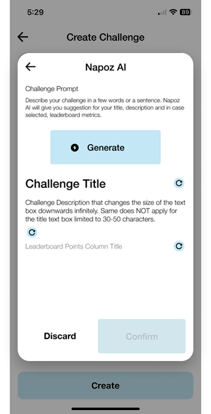
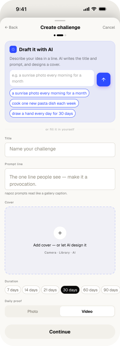
Defining a challenge — its title, prompt, and how it's scored — was the steepest part of starting one. So I folded an AI drafter into the create flow: describe it in a sentence and get an editable title, prompt, and cover, with a manual path right beside it.
And AI got its own color. The drafter speaks cobalt — deliberately separate from the coral brand — so an AI action never masquerades as an ordinary one, and you always know when the machine is writing.